A brand entering the UAE often treats the Arabic on its packaging as a translation job — send the English to be converted, drop it onto the artwork, print. It is one of the clearest tells of a business that has not worked in the region before, and local customers read it instantly. Designing a bag for the Gulf is not a matter of adding a second language. It is designing for two scripts that read in opposite directions, follow different typographic rules, and — in many cases — are required by law to both be there.
Here is what actually changes, and where foreign brands most often get it wrong.
Arabic is frequently not a choice — it’s the law
Before any aesthetic decision, there is a compliance one. Across the GCC, and the UAE specifically, many product categories — food and consumer goods above all — are legally required to carry Arabic on the label. For a brand used to markets where a second language is optional, this is the first surprise: the Arabic is not there to look local or welcoming, it is there because the product cannot be sold compliantly without it.
The practical consequence is that Arabic cannot be treated as a decorative afterthought squeezed into spare space. It has to be planned into the layout from the start, legibly, because a regulator or a retailer’s compliance check will look for it. Confirm the exact requirement for your product category before you design — it varies by what you are selling.
Right-to-left rewrites the whole layout, not just the text
Arabic reads from right to left, and that reverses the logic of the entire design. The natural starting point of the layout — where the eye lands first — moves to the right-hand side. Visual hierarchy, reading flow and the “front” of a bilingual face all mirror accordingly.
This catches people out because it is not only the words that flip. Directional elements — arrows, icons that imply sequence or motion — should reverse to feel correct to an Arabic reader. The logo and brandmark, by contrast, must not be mirrored. Knowing which elements flip and which hold is a large part of what a designer experienced in bilingual work brings to the table.
Arabic is a connected script — and that changes the type entirely
Latin type is built from separate letters. Arabic is cursive: letters join, and each character changes shape depending on whether it sits at the start, middle or end of a word, or stands alone. This single fact undoes a lot of habits carried over from English design.
You cannot letter-space or “track” Arabic the way you might spread out a Latin headline — pulling the letters apart breaks the joins and produces something that reads as broken to a native eye. Arabic also has no capital letters, so the emphasis a designer would reach for by capitalising is simply not available; emphasis comes instead from weight, size and colour. And because Arabic carries diacritical marks above and below the baseline, it needs more vertical breathing room — cramped line spacing collides the marks and looks amateurish.
A logo is redesigned, not translated
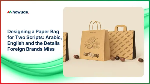
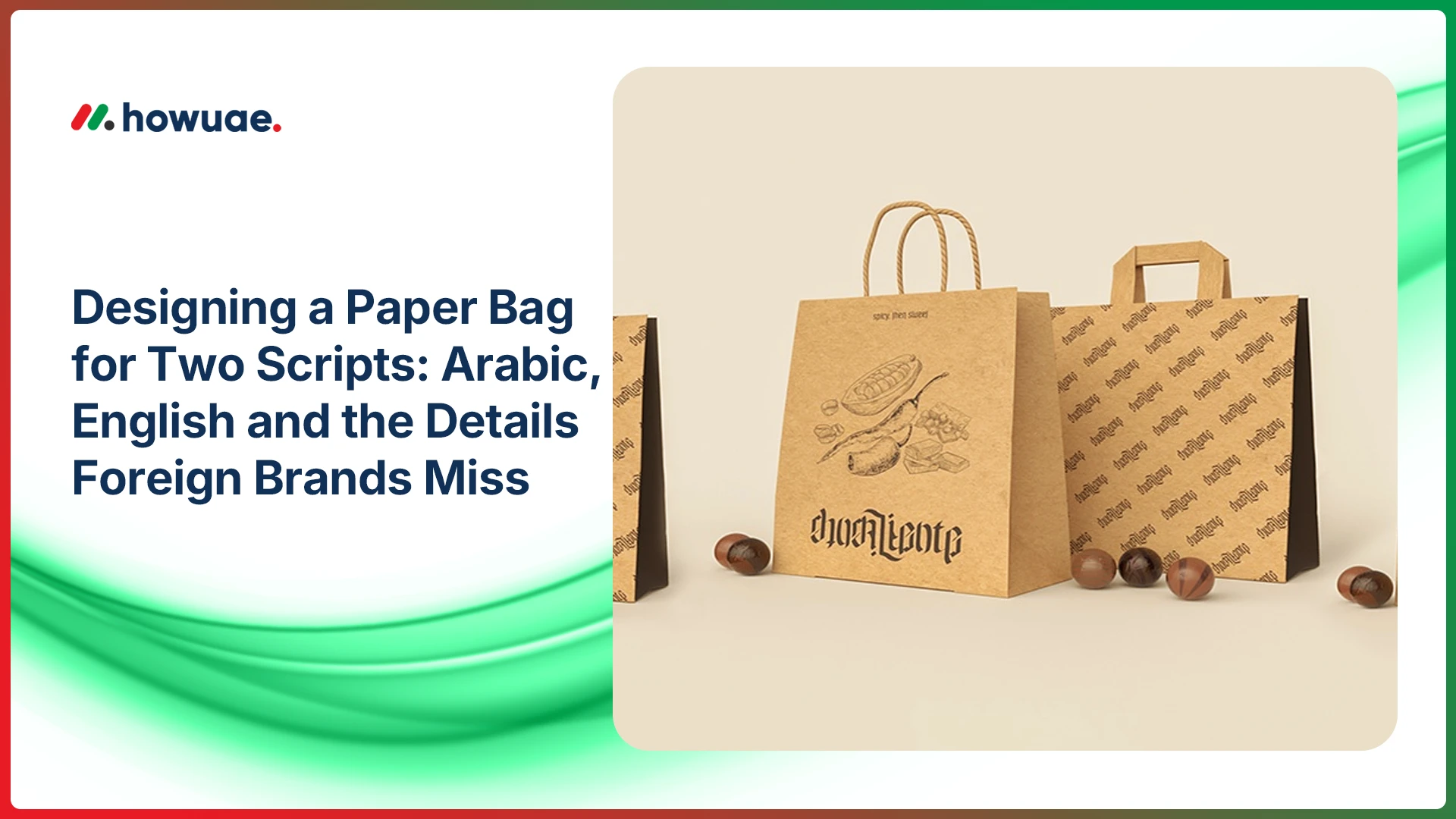
The bilingual logo lockup is where craft matters most. An Arabic version of a wordmark is not a translation you can generate — it is a redesign, ideally by a type designer or calligrapher, built so that the Arabic and the Latin share visual weight, proportion and character. Done well, the two scripts feel like one brand seen twice. Done by machine, they feel like two unrelated logos stuck together.
This is also the single most expensive place to cut corners. A wordmark rendered by an automatic translator, or set in a font that does not properly support Arabic, is the kind of error that a foreign founder cannot see and every local customer can.
The production trap that foreigners fall straight into
There is a specific, avoidable disaster that happens constantly: Arabic text is pasted into design software that is not Arabic-aware, and the application silently breaks the letter-joining — rendering the characters disconnected, and sometimes reversed. To someone who does not read Arabic, the artwork looks fine. To everyone who does, it is gibberish, and it goes to print.
The safeguards are straightforward but non-negotiable. Use design tools with proper right-to-left and Arabic support. Decide deliberately whether numerals appear in Eastern Arabic or Western form, and keep it consistent. And have a native Arabic speaker proof the final artwork before it is printed — not the translation in isolation, but the laid-out file, exactly as it will run. Producers set up for bilingual work help here too: a manufacturer experienced in bilingual paper bag printing, such as VITA GROUP, will flag joining and layout errors on the proof before a run rather than after it, which is the difference between a corrected file and a wasted print job.
Laying two scripts onto one bag
A bag has an advantage a flat label does not: it has more than one face. That opens up choices. You can lead with English on one face and Arabic on the other, giving each script a clean, uncrowded presence. Or you can build a balanced bilingual lockup on the primary face, with both scripts sharing the hero position.
Which script leads depends on your audience and the setting — a luxury retail bag aimed at a mixed international clientele will weight the two differently from a bag for a neighbourhood bakery. The one thing to avoid in every case is treating Arabic as the junior partner: shrunk, tucked into a corner, or clearly designed second. In this market that reads as carelessness, and it undermines exactly the local credibility the bag is meant to build.
Getting it right
None of this is difficult once it is understood; it is expensive only when it is discovered at the printer. Treat Arabic as a first-class part of the design rather than an add-on. Work with a designer who has actually set bilingual artwork, not one improvising for the first time. Confirm the labelling requirement for your category up front. And proof the real, laid-out file with a native reader before you commit to print.
For a brand arriving from outside the region, getting the two scripts to sit together properly is a small investment that signals something larger — that you understood the market well enough to design for it, rather than translating your way in.